The perfect markdown editor for writers, IMO
If a markdown editor isn’t easy to look at, has settings you can tweak to your eyes’ content, then it’s not a markdown editor it’s a text processor
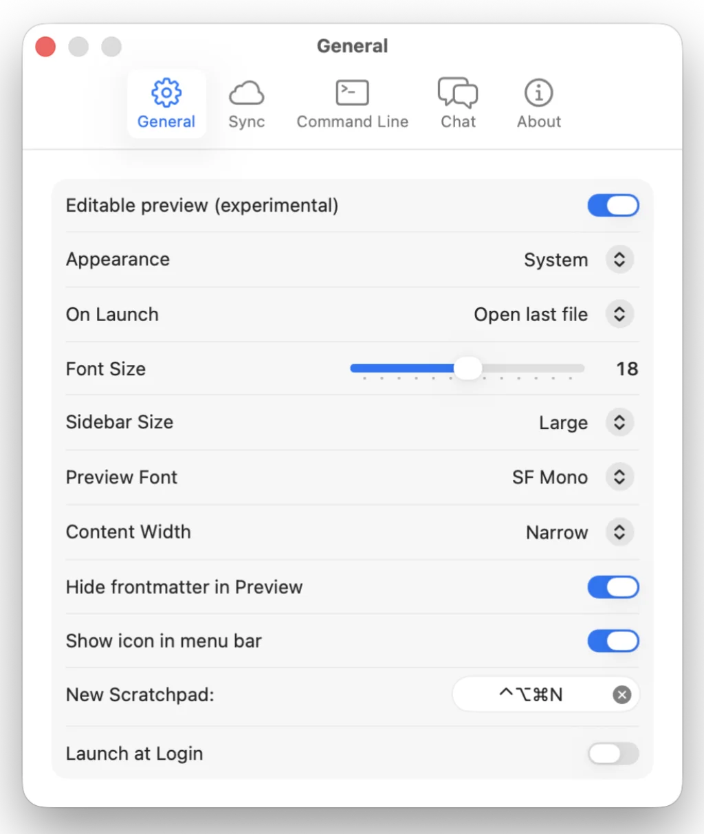
As a former (production) journalist, still doing the occasional work, I have been used to dealing with different systems: from PCs using WordStar or MS Word to the latest design tools on Mac.
What I learned early on – back in the late 1980s – was that plain text talks to any system. Hence my subsequent love of markdown and some of the tools used in its delivery. The late 1980s was also a time when typewriters were on their way out, with computers taking on many aspects of business operations, especially in publishing.
So, when I look at a markdown editor I am first and foremost looking for a writing tool, one that sings like Nina Simone on crack.1
First and foremost, I look for an editor that feels and looks like an editor. In order to do that, it must offer some means of controlling the editor width; full width text just doesn’t swing it for me. I like to work in full screen when I’m writing, so no amount of adjusting the app window to achieve the perfect width will do. If an app doesn’t allow you to control the editor width, then it is not a markdown editor; it’s a code editor masquerading as a markdown editor, or it’s a processor.
The trouble with many so-called markdown editors – especially those written in AI, but not all – is that markdown is seen as another language to be processed rather than written in. The clue lies in the name, ‘editor’. So, this site tends to look for a home for your notes, a true markdown editor.
The ideal markdown editor…
… looks a lot like this:
- Font choice: ideally allows users to choose from whatever they have installed on their system. At a minimum, select from monospace (my preference), sans-serif or serif for the editor, not the preview.
- Font size: adjustable between 12 and 24px in 2px increments. Size matters when it comes to font size, as some writers may have eye conditions.
- Line-height: adjustable from 1.2 to 2.0 in increments of 0.1.
- Editor width: call it what you like – Obsidian calls it ‘readable line length’ – but I prefer ‘editor width’. Many apps have their own way of describing editor width, such as narrow, medium, wide.
- Vault list: the index of folders/files or vault list, allows you to jump from one note to the other with ease. It should have the option to show/hide the list.
- Markdown code/syntax highlighting.
- Tables are recognised, especially in preview.
- Wiki links: I don’t tend to use wiki links, as a researcher or student might. I only use them in a number of content lists that allow me to navigate (remember) documents I want to access easily.
- Split editor: ideally allows you to have two documents open, one for your writing, one for reference or research. This is nicely handled in Obsidian.
- Exports to html, .md, .rtf, .pdf. I use rich text to stand in for .docx, which I am fortunate in not having to worry about any more.
These are features I consider inessential, but some may have different views:
- Daily notes. I have my own system for this.
- Drawings, charts or mermaid diagrams, despite the fact that many will be looking for this as a default.
- AI access: must be opt-in not automatic enrolment and, ideally, the interface shouldn’t scream ‘use AI’ at the user, with icons, menus and widgets sitting up and begging to be clicked.
So, there you have it. This, in my opinion, is what makes the perfect markdown editor for writers. What do you think? Answers on a postcard…
The small print
Not that Nina Simone ever did crack that I know of. And I don’t want an app that actually plays music, Nina Simone or otherwise, as one effort I came across did. Sorry, I can’t find the link any more. Probably died a slow, painful death, I hope.